Lesson 11: How to Create Responsive Layouts
When you export HTML5 from InDesign with in5, it's viewable on any device, but how do tailor your layouts to those various devices? This lesson will show you how to create a layout that adapts for different devices and screen sizes.
Expert Contributors to this lesson

Justin Putney
Estimated time for lesson
Today’s lesson should take approximately 25 minutes.
Today's Course Outline
- Scaling for Desktop Computers (and Mobile)
- Scaling to Mobile Device Screens using the Viewport
- Using InDesign's Liquid Layout Features
- Creating Alternate Layouts
- Exporting Alternate Layouts as Responsive Layouts
Introduction
in5 has multiple ways to create a fully responsive experience. Sometimes a single design will works across all target devices, sometimes multiple layouts are required. It depends on the design and the target devices.
This lesson will start with the simplest options and move up in complexity as you progress down the page.
Easy Scaling for Desktop Computers (and mobile)
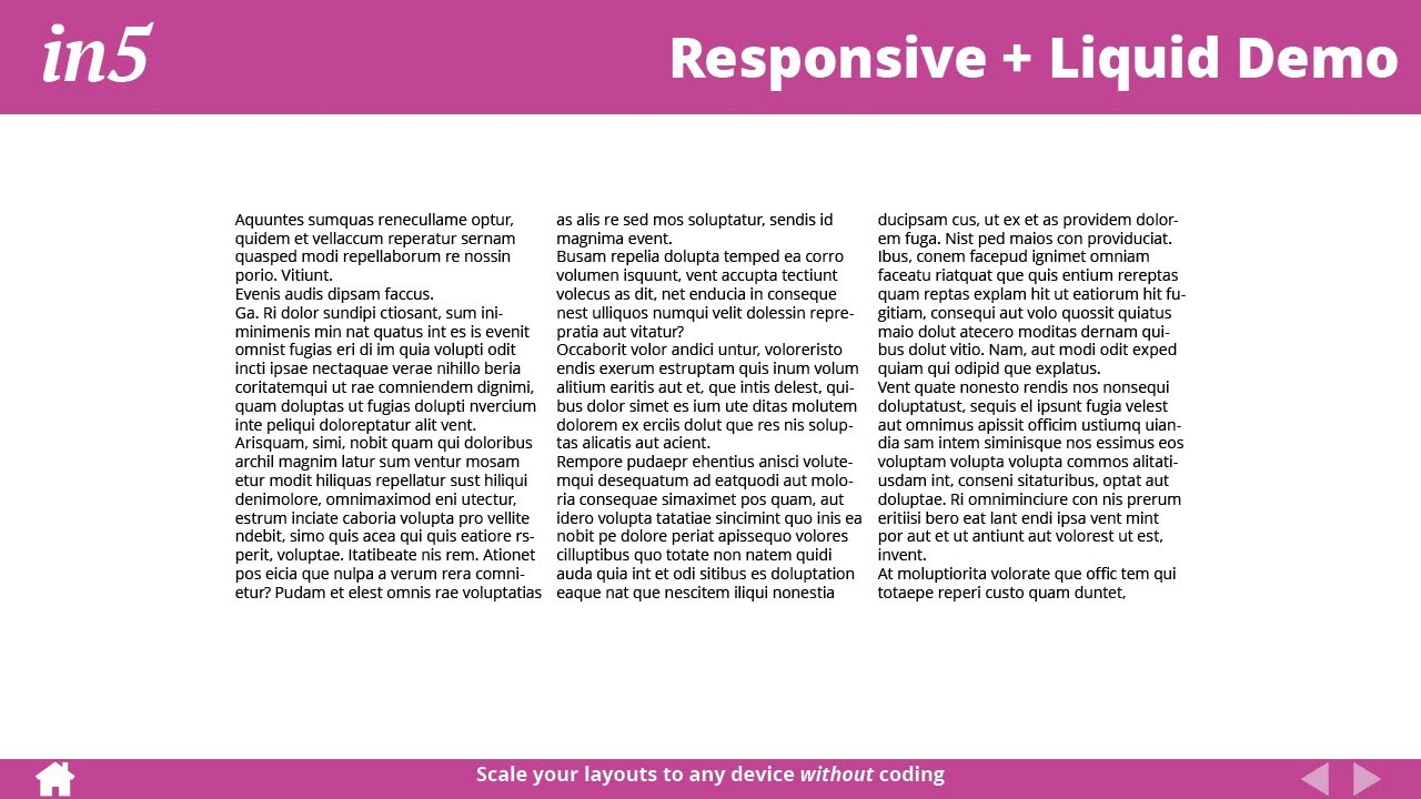
You can easily scale your layout so that it fills the screen proportionally.
Follow the steps below to add scaling for desktop computers.
Simply choose a Desktop Scaling option in the Advanced section of the in5 dialog.
The available options are
- None - Turns off Desktop Scaling.
- Best fit - Fills the browser window as much as possible while still maintaining the layout.
- Fill width - Fills the width of the browser. The height of content may exceed the window.
- Fit height - Fills the height of the browser. The width of content may exceed the window.
Your content should then change sizes, while retaining the same layout, as you scale the browse window.
To apply this scaling to mobile devices as well, simply select the Use Desktop Scaling option in the Mobile Device Viewport Zoom setting.

Using the Desktop Scaling on mobile provides you with options not available using the Mobile Device Viewport Zoom (below), such as scaling to the height or best fit.
Scaling to Mobile Device Screens using the Viewport
By default, when you export using in5 and view your files on a mobile device, your pages will automatically fill the width of the screen.
in5 automatically scales your InDesign layout to mobile screens
This is controlled by the Mobile Device Viewport Zoom setting in the Advanced section of the in5 export dialog.
The following Mobile Device Viewport Zoom options are available to help you control scaling on mobile devices.
- Let in5 Choose (default) - in5 will automatically choose the Viewport Zoom setting based on the Page Format used to ensure that the layout fills the device’s viewport. This setting will set the Zoom to 100% when the Liquid Page Format is used, and will Zoom to the Page Width in all other cases.
- Let Device Choose - No viewport setting is added and the mobile device estimates the best sizing for the content.
- Use Desktop Scaling (recommended for consistency when using Desktop Scaling) - Applies the chosen setting from Desktop Scaling to mobile devices. This is the only way to scale the height, as well as both the height and width. The Viewport can only scale to the width.
- Zoom to Device Width - Zooms the device display so that the content fills the width of the device.
- Zoom to Page Width - Zooms the device to match the width of a single page.
- Force 100% Scale - Ensures that the device will not zoom in or out by default.
The main downside of this scaling method is that the viewport settings are ignored by desktop (and laptop) computers (unless you're using the Use Desktop Scaling option). This may not be a downside if you've already designed your layout at its ideal scale.
Pro tip: You can use the Mobile Article Explorer to make a mobile-friendly (and SEO-friendly) reading experience, even when rendering a precisely-scaled layout and text is rendered as images (or continue on in this lesson to see how to make separate layouts for smaller devices).
For more details on using the Mobile Article Explorer, check out the Creating Your First Interactive Document video course.
Using InDesign's Liquid Layout Features
What if you'd like to change your layout as the browser window scales?
Fortunately, InDesign has a Liquid Layout panel for such cases (Window > Interactive > Liquid Layout).
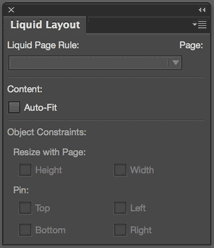
The Liquid Layout panel lets you set "rules" for your pages.
- Scale - scales all the objects on the page proportional to the window.
- Re-center - keeps all the objects centered in the window.
- Object-based - lets you set up rules for each object.
- Guide-based - uses document guides to scale and position objects.
- Controlled by Master - uses the rule applied to the page's Master Page.
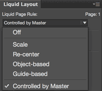
The Object-based rule gives you the most control. If you apply the rule to your Master Pages, then your document pages should have the Controlled by Master rule applied.
With Object-based rules, you can control how each object is scaled and positioned.
For example, here are the rules for a Home button on the Master Page.
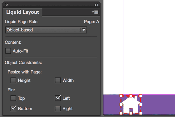
The Home button is pinned to the bottom left and has Resizing turned off.
Previewing Page Rules Effects
To preview your page rules without leaving InDesign, select the Page tool.
The page will be surrounded by eight rectangular handles. Drag one of the handles to preview the Page Rules in effect.
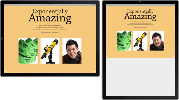
This is the document with the same Home button from above.
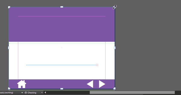
Note that no matter how it's scaled, the Home buttons remains the same size and rests in the lower left-hand corner.
When you release the handle, the page and the items on it will snap back into place.
To export your in5 document with the Liquid Layout rules applied, choose Liquid as the Page Format in the in5 dialog.
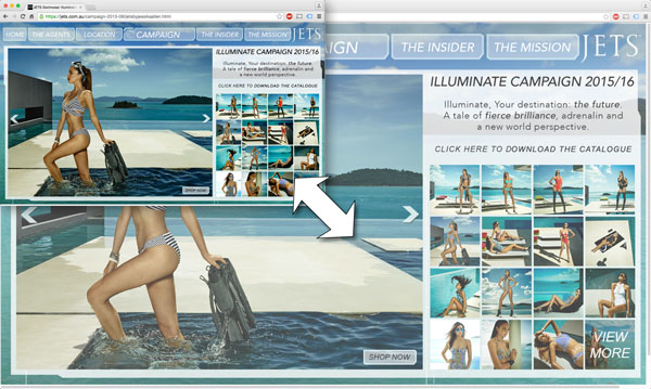
A single Liquid Layout is great for simple files, like this animated web banner, but for more complex layouts, the Desktop Scaling is a great and quick option...or you can create Responsive Liquid Layouts (more on that below).
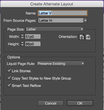
Creating Alternate Layouts
Liquid Layout rules can also help to speed up the creation of Alternative Layouts.
Alternate Layouts are created from the Pages panel.
When you create a new layout, assets are copied from an existing layout to the new one. Any Liquid Layout rules that have been applied to the existing layout will be used when creating the new layout. This can save you a lot time, since you won't have to make so many manuel adjustments after creating the new layout.
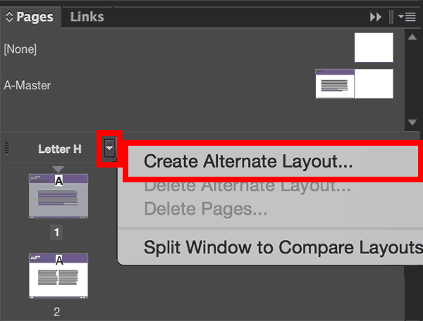
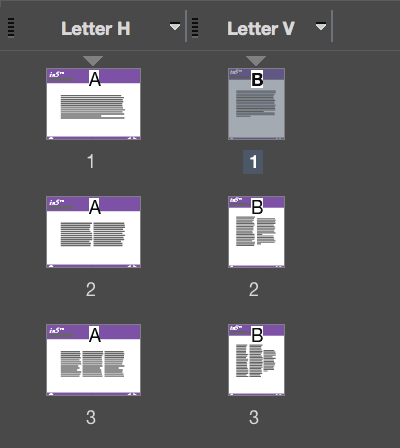
Alternate Layouts let you create different layouts for different devices and keep all of your assets together in one InDesign file.
The layouts are shown side-by-side in the Pages panel.
If you need to create drastically different layouts for different devices, in5 will let you specify a specific layout in the Export Range menu.
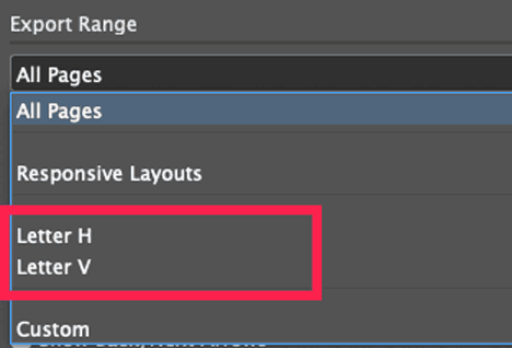
This will allow you to export each layout to its own directory. You can then create a "landing page" that directs viewers to the layout that best matches their device.
You can then create a landing page lets viewers choose the option that suits them.
The iPad and Android versions can be exported, if desired, to Web Apps that can be saved to the mobile user's Home Screen. We'll look at Web Apps in an upcoming lesson.
See the free course on Web Hosting on how to build and upload a landing page from InDesign and in5.
If you have a Gold subscription, you don't need to create separate pages—in5 can export your Alternative Layouts into a single responsive experience (no landing page needed)!
Creating Responsive Layouts
The basic steps are pretty straight-forward.
- Create your primary layout (and all its pages).
- Add Liquid Layout rules (optional—makes the following steps easier).
- Create Alternate Layout(s) (Layout > Create Alternate Layout or using the Pages menu).
- Reposition elements in new layouts (as needed).
- Export with in5 using Responsive Layouts.*
* Exporting Responsive Layouts with in5 has a few requirements.
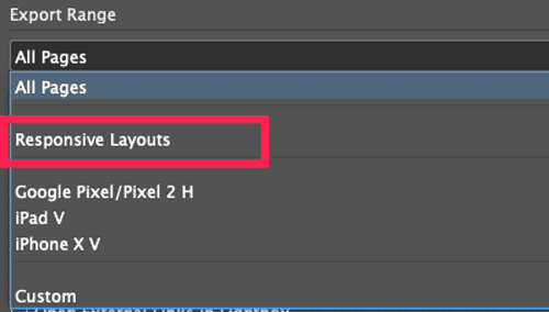
- You must have a Gold plan or higher.
- You must have Alternate Layouts in your document.
- The layouts must have matching page counts (in5 switches between matching pages when you scale the browser).
- The layouts must have differing page dimensions (so in5 knows when to adapt the layout).
For more details on these steps, see this additional tutorial.
You can also combine Responsive Layouts with any of the scaling options covered in this article.
Be sure to watch the video below to see the variations of the settings described in this lesson.